In 2004 I was newbie in embedded Linux area. Decision to buy Sharp Zaurus instead of HP iPaq got me to Qt/e world rather to GTK one. I was also KDE user rather than GNOME2 as well so I can say that I liked Qt already.
All those sizes in pixels, paddings and margins I saw in GTK code made me feel sick each time I had to edit UI of some application. No idea why developers went that way…
In Qt world all you had to do was launching Qt Designer, put some UI elements into window, apply some Layout elements and build your app. No need to deal with padding/margin settings etc cause library that for you.
In meantime Qt developers added QML as a new way to do UI for Qt applications. I ignored it’s existence until now…
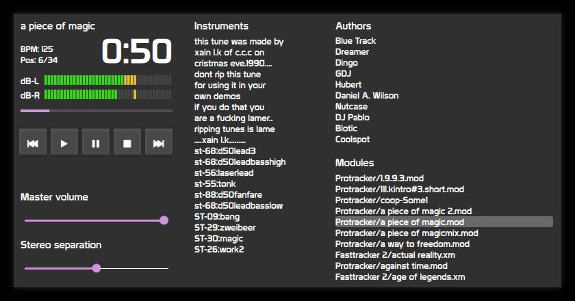
Few days ago Michał Schulz did nice work on improving my Modland player. He also moved it’s UI from old Qt Designer one to QML.

For now UI is hardcoded to 800x480. I have tried to make it scalable but have a feeling that QML is against me.
Look at Authors/Modules part. It is simple layout, right?
- label
- listView
- label
- listView
In Qt Designer UI I would select those four elements, put into GridLayout and it would scale properly. So I tried that for QML. Labels survived, listViews got 0x0 size.
And the only ‘design tool’ to edit QML is Qt Creator. Which gets fugly unstable once you try to play with QML designs…
So I looked at files describing UI. And you know what I found there? Old GTK nightmares… Positioning elements with pixels, sizes in pixels. Pixels! Not some magical “dp units”. There is no way to say “make this element 10em tall” like you can with CSS.
And it is not only with Modland player UI. Same it with QML examples…
WTH happened with Qt developers? Or was “QML is only for embedded devices, do not use on desktop” phrase got removed from documentation by mistake?