I use Qt on my devices since my first LinuxPDA: Sharp Zaurus SL5000 on which I used OpenZaurus with OPIE as primary environment. It was based on Qt/Embedded 2.3.x and was looking ok. UI of most applications work properly in both portrait and landscape modes, adapted to size of fonts (I used smaller then default ones).
Then Zaurus c760 arrived at my place and I did some UI code tweaks to make everything looking better on VGA screen (not that it looked wrong — I just improved few things). At that time I had nearly every Zaurus model in hands and took care to make all looks proper in both orientations.
From time to time I was also playing with 3rdparty applications to adapt them to resolutions higher then QVGA (which was sort of standard in palmtops of that era). Usually loading UI files into Qt Designer and reordering them or adding layouts helped. One of them was Mileage which required adding huge amount of layout elements just to make it look properly (all elements were put as X,Y positions originally).
Some time later I moved to GTK/X11 based environments on portable devices and later my cellphones took PDA place.
But with Nokia N900 I decided to go back to programming with Qt - 4.6 version this time. First was my module player (which I probably never end) and some time later I decided to play a bit with Vexed released by Paul Romanchenko (rmrfchik on #maemo) where I reorganized UI a bit, added portrait support and did few other tweaks.
But then I switched to ApMeFo and while idea of application is good the UI is disaster:
- tabs in main window
- lack of portrait support
- unusable UI when forced to portrait mode
- use of non standard button sizes
- use of non standard font sizes
And sources lacked UI files… So one day I decided that it will be good occasion to learn something new. Author was not responding to my sources request so I launched Qt Designer and started to recreate UI from scratch — using existing sources as information what kind of widgets were used. Took me some time but I got new, a bit improved UI which even worked in portrait mode:
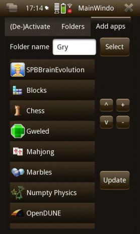
But it still was not what I wanted. It still had tabs and small buttons… First I got rid of tabs:
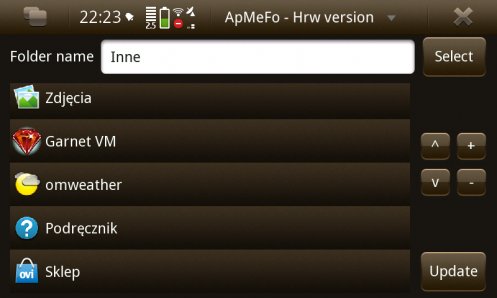
Rest of functionality was moved to menu and separate window:
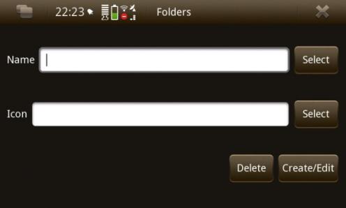
I was not too proud of it. OK, it looked better, I even changed some non-UI code but it still was not what I wanted to achieve. But at least I had something what I could give to users for testing.
How does it look now? Let me show not yet published version:
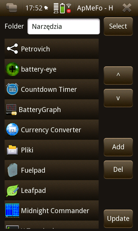
First main window — all buttons are finger friendly. I also grouped them a bit — it is visible in portrait mode which is also great when user want to re-order items.
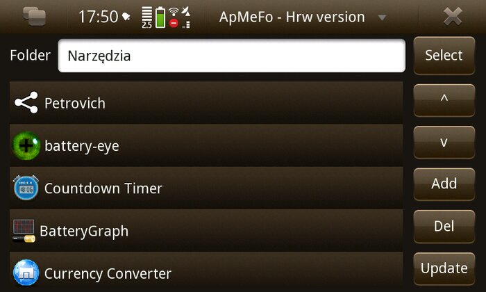
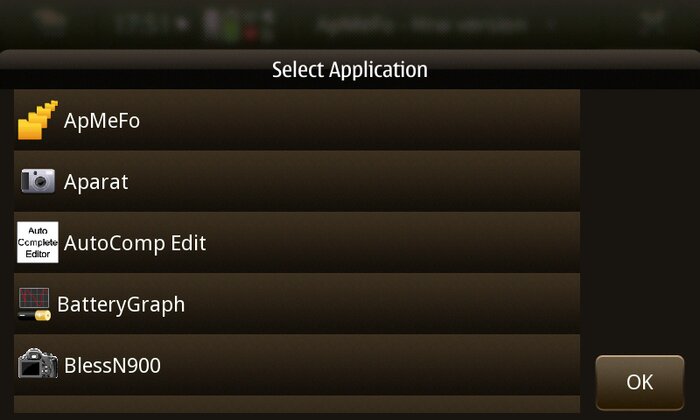
Dialog to select applications to add got some changes too. It is maybe not conform with UI style guide (OK not under but on right) but it gave me extra line in list widget. Think of multi selection…
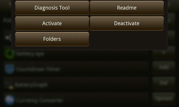
As you see (de)activation and folders are now in menu. (De)Activation has also Yes/No requesters :)
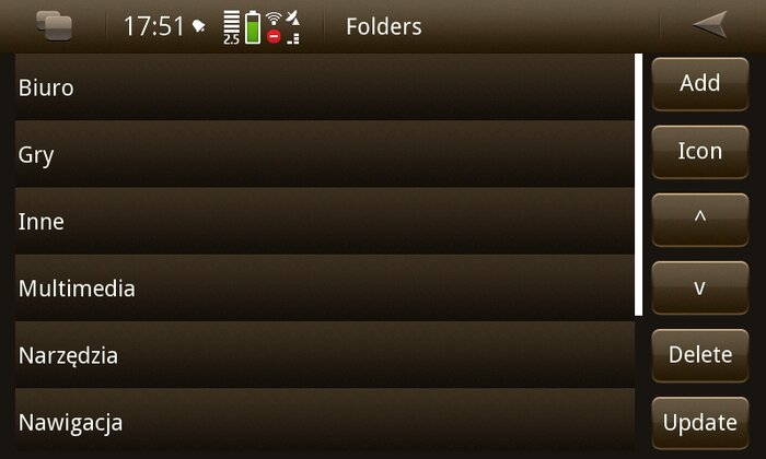
Folders window is place which needs lot of work. Only delete works now (also with Yes/No requester).
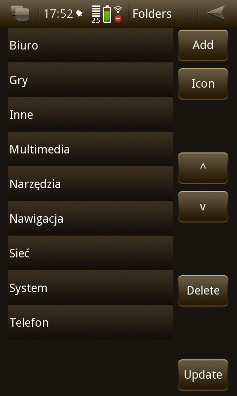
List of things to do is long as users suggested many things. I probably will not add most of them because so far I did not checked how exactly ApMeFo works but once I will read rest of source code I think that something good will come from it.
And is designing UI simple with Qt? I think that it is — developer does not have to worry what kind of paddings are needed to be used, how to place widgets to make UI conform to style guide rules etc. Once you do design with layout elements application adapts itself to what is available.