Week ago I was at SmartDevCon conference where Samsung was main sponsor. They had some contest which I won and got Samsung Galaxy S4 (GT-I9505) phone.
Phone arrived on Friday just before my trip to WeCan demoparty so I had to spend some time with original software instead of starting from flashing CyanogenMod. It was painful experience…
Hardware is nice — Qualcomm Snapdragon 600 with 4 cores, 2GB ram, 5” fullhd screen made it nice device but software… I had a dejavu and felt like travel back in time to moment when I bought Nexus S. Why? TouchWiz looks and feels like Gingerbread ;(
I have read many times posts where people complained about it, saw it on Galaxy S2 but never thought that it is so bad until played with it for few days.
As a person used to clean AOSP interface I had problems finding my place with it. For example dialer:
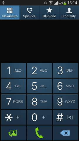

As phone is running Android 4.2.2 I would rather expect Holo compatible UI with tabs which can be switched by simple swipe. But no, Samsung decided to give users Gingerbread style with tab captions to tap if you want to switch. I did called few people by mistake as swipe right is call (left == send text message). Sure, dialer can be replaced by other application from Google Play Store but why?
Compare it with standard Android dialer on my Nexus 4:
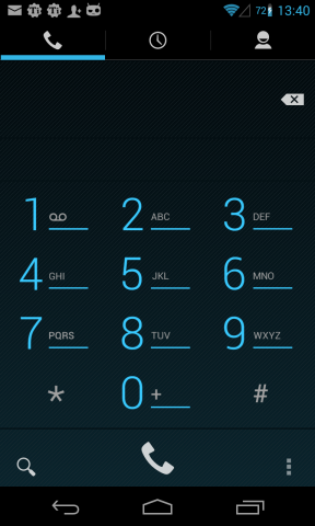

Note also indicator icons on status bar. On Nexus WiFi icon is near to GSM signal one to not take precious space — not possible for Samsung. And while on AOSP network speed icon (GSM/EDGE/HSPA(+)) is above signal one, TouchWiz has separate one — just like it was in Gingerbread.
Or notification panel… This one is insane:
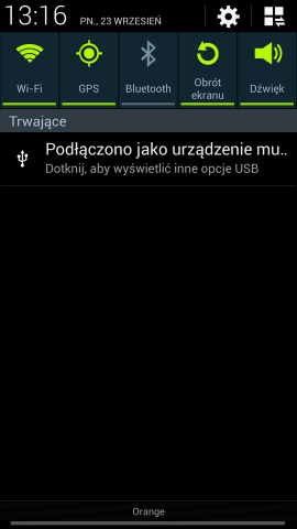
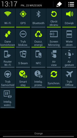
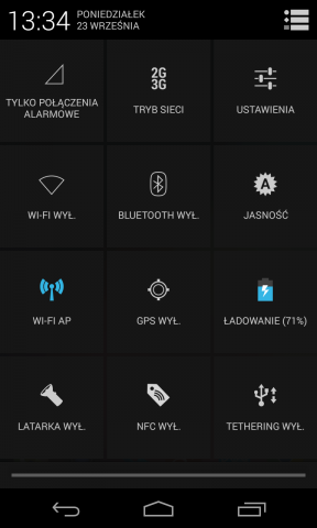
I already disabled brightness slider which was there as well. Note how pressing button in right top corner changed switches from ribbon to be full screen. I would like to remind Samsung that Android 4.2.2 has Quick Settings panel for such stuff (screenshot from my Nexus 4):
I could add more and more screenshots and complain about many things. But will not because I feel sick when have to use this UI. But just two more, Settings and recent apps:
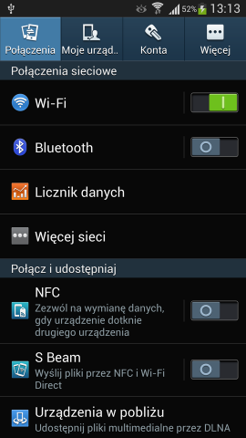
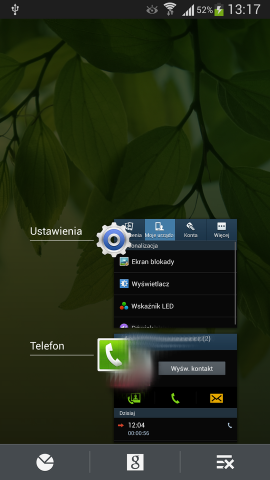
Note tab captions again, huge fonts (with text size already set to “small”). Recent apps list is another crazy thing. Device has “hardware” buttons so “Google Now” is harder to run now.
Speaking of buttons… Let me quote Android documentation for developers:
Beginning with Android 3.0, the Menu button is deprecated (some devices don’t have one), so you should migrate toward using the action bar to provide access to actions and other options.
And Honeycomb was released over two and half year ago. Recent apps button would be much more useful.
So what next? CyanogenMod 10.2 (Android 4.3 based) will land on device as usual.