I plan to write blog post on each working day about my experiences with N900 device. Today I planned to concentrate on PIM applications but decided to write about other things.
Brainstorm
Brainstorm — the person which invented that was genius. In normal projects if someone wants to request enhancement then bug tracker is used. Bugzilla even has such value in severity field. What is a result?
Several bugs got “moved” to brilliant Brainstorm area of Maemo website. Ok, you can add idea of solution there or vote for (or against) that. But you can not comment on solutions or ideas. For some entries in brainstorm there were comments with “discuss that idea in this forum thread” but seriously — how many developers like to use forums? I do not like — prefer to get email notifications from bug trackers where I can comment on bug and vote for it. I can quickly search for all entries where I commented etc. Brainstorm does not give me that. But I do not know, maybe the idea was to make users shut up and be happy with software which they got.
UI
Maemo5 UI is slick, nice and finger friendly. Last thing also means that most of screen resolution is used for paddings, margins and frames. Basically do not expect more then 6 lines on list widgets.

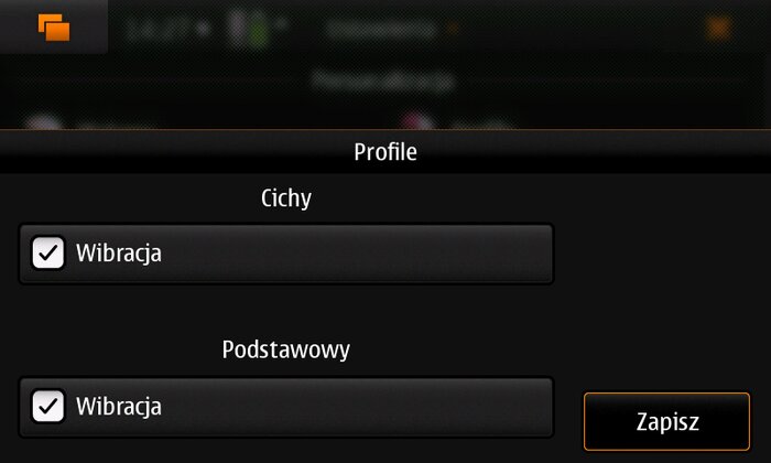
Kinetic scrolling of course is present but also scrollbars are hidden so most of time it is hard to notice how many entries are available. Problem is even bigger when layout object is scrollable — it took me some time to find out where I can change ringtones to the ones which I used on previous phones (I use same ones for over two years). The problem was this screen:

There are options under them… but no visible mark that user should scroll ;( It was discussed in a few bug reports) but for me it looks like it will not be fixed.
Portrait mode would improve things a lot but is not available and looks like will not done for Maemo5 (except few applications). Contacts list in phone dialer (the only one portrait enabled app) contains 10 entries. Kinetic scrolling works much better in that orientation and user got also alphanumeric shortcuts to scroll list even faster (due to lack of keyboard in portrait).
To summarize: UI is nice, but some work should be done to make it more useful.